Friday, 24 February 2012

Self Promotion

Reference


Photography


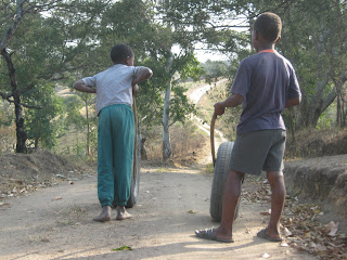
For the self promotion brief I went back to a place that inspires me the most, Portshepstone rural areas. I took photographs with not much direction but intuition was what really led my way. It was when I came back home to Durban that the idea was sparked when I asked “Could you please pass the salt?” It was the boy chasing the chicken on the Cerebos container where my concept was born. The whole concept is inspired by the image that has been in our homes for so long and that is the Cerebos Salt image of a boy chasing a chicken. I went with the tag line “Chase a dream and make it a reality”. I used a boy playing with a wheel because a child’s imagination runs wild and they chase dreams. When children play they imagine so many things and they make it reality by action by playing. I played around with that image and incorporated it with my concept. What i am trying to say is that the client will come to me with their vision(concept) and I make it a reality through design.

I chose to do my own font and illustration. I was inspired by David Foldvari’s way of illustration.

Font Illustration


Final Font Illustration


Illustration


Font & Boy


Logo Construction


Final Logo


Corporate Identity


Promotional Items


Editorial

Magazine Chosen


Double Page Spread Inspiration

Layout Options


Reference


Pencil Sketch


Digital Rendering


Final Double Spread


Fonts Used In Editorial


The brief required me to come up with an Illustration for body copy with choice for a double page spread. I also had to be inspired by an existing South African magazine that dealt with design. I chose to use One Small Seed because it best defines design for me and the layout flows from the first page to the last. The Editorial I chose was ‘Slaves To The Anguish’ which basically is about the Emo culture which is inspired by punk rock music and fashion.

South African Cookbook

Photography


Illustrations


My cookbook was based on dessert and the sweet tooth. It looks at the three predominant races in South Africa (Coloured, African and Indian). I focused on dessert because that is linked to our inner child and nothing can beat the way mothers continue to take this out of us through their culinary skills. Our inner child is a part of us that we can not escape and we even find it in food. I chose three desserts. Koeksisters which are sweet, syrupy and very sticky twisted or braided donuts for the Coloured guy. Amahewu which are traditional drink made from precooked maize with a lot of sugar for the African(Zulu) guy. Gulab Jamun is a dessert that is made from flour and is deep fried, it also dipped into rose water scented syrup and it is for the Indian guy. I chose to illustrate men in their cool as the first image and the next image is after they have eaten dessert and them showing their ‘sweet tooth’. Many guys believe they are born and bred an outie, mjita or laitie but in fact their mothers determine that through their cooking because it has the ability to take the real person out, their inner boy.

The Cookbook


Thursday, 23 February 2012

Donut & Vitamin Packaging

Donut Packaging Scamps


I chose to design the packaging for Bread Ahead. Their existing packaging is weak and not enticing. It doesn’t make the consumer want to have what is inside. It just serves its purpose to transport donuts, the aim of engaging with the consumer is lost and left at the counter.


The touch element is brought back by adding shape instead of a box the hands are accustomed to. The holes on the side of the packaging also give the consumer a choice of inserting their fingers or not and carrying the box in that way. They also serve as a way to tempt the consumer because they’ll also be touching the donuts in a subtle way. The openings on the packaging appeal to the smell sense because the donut smell will come through them. The donut illustration at the top of the box has places where you can see through the transparent plastic and the sides have the same.

Digital Mock Up


Mock Ups


Vitamin Container Scamps


Vitamin Container Dimensions


Vitamin Container Construction


Vita-Dream Container


How to use


Point Watersports Club/ Logo & Branding

Logo Construction


I was required to design a new logo for the Point Watersports Club (PWC) and the overall brand identity across its various platforms. The primary aim was to develop a strong recognizable brand that will help the Point Watersports Club (PWC) enhance their visibility. The Point Watersports Club (PWC) must represent the following clubs, Point Yacht Club, Durban Ski Boat Club and Durban Undersea Club.
For the logo I played around with my negative space, the space between the 'P' and 'C' forms waves to empahise the water aspect. The colours are different shades of blue from the ocean.

The Branding


Corporate Identity